A Portfolio with Personality
Making my portfolio more me
11.13.25
I am currently revamping my portfolio, including a full rebrand to express the next chapter of my design journey (more on that next month). In no way would I consider myself an expert when it comes to portfolios, but one thing I have realized in my many iterations is that portfolios need to represent you. I know this may seem REALLY obvious but it is something that has taken me years to fully implement. As I look at my newly selected color scheme, I can see my personality exuding from the pages in a way it hasn’t in the past. I’m no longer just going through the motions of what I think a portfolio should be or making it to please professors in hopes of an A.
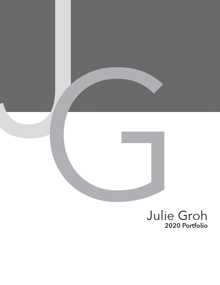
I made my first portfolio in 2019 to conclude my first year of school. There was A LOT riding on this portfolio, it was what was going to determine if I made it into second year. At my school, they had yearly reviews, the first being the most brutal where they would cut the class down from around 60 students to 20-25. The design of my portfolio was pretty simple, a white background with black accents including a bar that went across the top of the page. It had all the elements of a portfolio: sketches, mock-ups and hero shots. Despite having all these elements it lacked personality. To be fair, I was told that my clean layout and visual design was one of the things that helped me move on in the program, but it wasn’t me. What my professors may not have known was why I chose that layout and design. The colors were because that’s what I thought an industrial design portfolio should be and what my professors would want. We were told to be careful to not choose colors that are too “girly” like pink because it would hinder us in a male dominated field. When I looked through example portfolios they all had this similar greyscale motif with either dark edgy backgrounds and clean renders or simple white backgrounds with dark text. So that is what I did… for years.
For my second year midterm portfolio, I tried to inject more of my personality opting for eggplant purple accents. A color I thought wouldn’t read too feminine and would still fit in with the dark aesthetic I saw online. I don’t remember exactly what I was told but what I do remember was my professor hated the purple and gave no clear solution on how I could add that color pop I desired. By the time the end of the semester rolled around I was back to a greyscale portfolio.
I was still designing to please and not just in my color choices. In class I presented a series of mockups. My professor pushed all of them aside except one and said, “This one”. So that’s what I did. I spent the semester on this form only to be told at the final presentation “ There’s something wrong with the form, but I don’t know what”. I was so annoyed because he chose the form. I learned a valuable lesson from this on intentionality and that at the end of the day it’s your portfolio not your professors. “My professor told me to” is not a legitimate reason in an interview, if only I applied this new learning to other areas as well.
In my third year, we did a lot of lead up work before starting to create our first website portfolio. This included making personal mood boards and surveying others about what colors they think reflect us. In terms of colors, I was told pink, yellow and a variety of purple shades. Looking back at those assignments, I can see the authenticity in them and it makes me almost sad to see them juxtaposed with the work I was putting out. This year’s portfolio teacher was equally harsh about my color choices and how I was representing myself in my personal branding. I was getting Cs on a weekly basis, for no clear reason. What it told me was that I wasn’t a real designer because I didn’t have the same aesthetic as those around me.
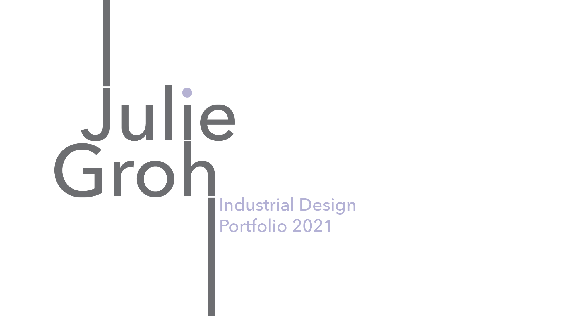
After a slight identity and design crisis, I realized that once again it’s my portfolio and if someone isn’t going to hire me because of the color of my portfolio then I probably don’t want to work there. I started small with a couple light purple elements like the dot over the “i” in my logo. But, I ended up redoing my entire portfolio and resume keeping some grey but balancing it out with purple. For the first time I could see myself reflected in my work. It made me excited to work on it. Subconsciously, I think I was still being cautious. The purple isn’t the bright lilac many said represented me but a more saturated version, but at least it was progress.
As I began working on my new portfolio I spent a lot of time on the colors. I could feel myself falling into old patterns, worried about how the colors would be perceived. But this time I’m not designing to please, I’m designing something that is me.


